Communicating the state of the COVID pandemic in Germany
The Challenge
Provide the public with accurate information about the COVID pandemic so they can make decisions based on facts.
The Result
A single platform that offers visitors to explore healthcare data from diverse perspectives and through multiple media types.
Our Expertise
- Data Analysis & Visualization
- Ideation & Concept
- UX & UI Design
- Full-Stack Development
Enable the public to make informed decisions about the pandemic situation
Rapid and effective communication of data-driven information is a core principle of modern public health practice. It can enable people and communities to make informed decisions and transform the general relationship between society and health authorities.
The German Federal Ministry of Health strives to follow this approach and inform the public about the coronavirus pandemic using various datasets.
Visitors per week
Data updates per week
Languages available
A single platform offering multiple perspectives on healthcare data
We created a website that visualizes and describes various disease-related datasets from multiple sources. It offers visitors with different backgrounds and levels of knowledge an easy way to explore this data from diverse perspectives and through multiple types of media.
Visitors can focus on the current status, analyze the development over time, examine a geographical region of interest or compare the situation in different age groups. These perspectives help to contextualize the data and provide a bigger picture of the pandemic. They provide their information in visual and written form to bolster understanding.
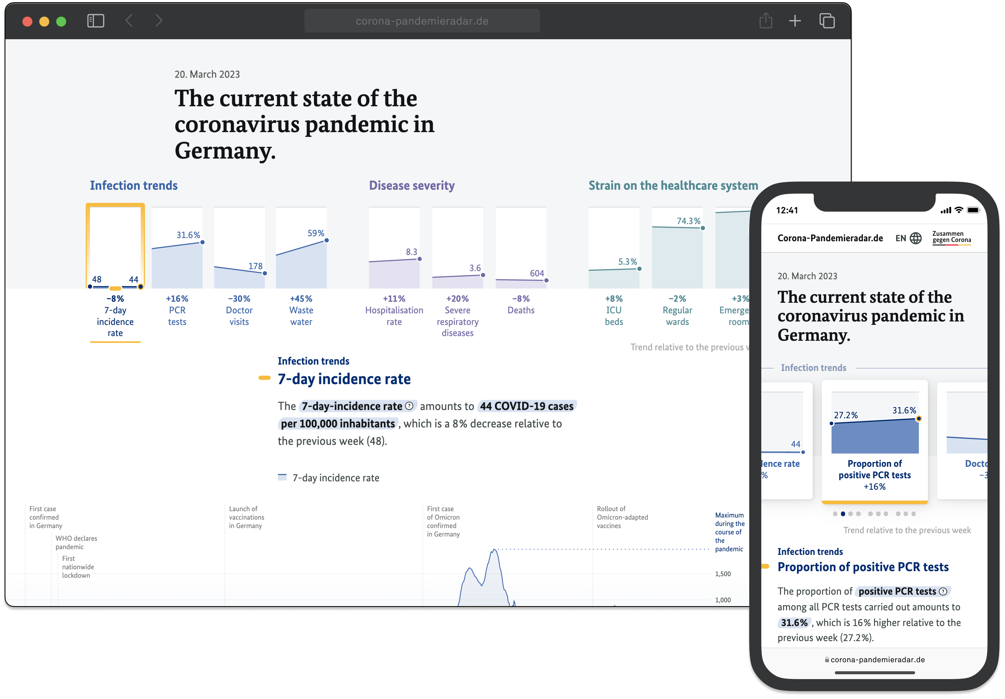
Communicating trends and the current situation
The header communicates the pandemic’s overall situation and direction, visualizing ten indicators and their trends. It helps to compare the indicators, puts them into perspective and allows visitors to navigate between them to retrieve detailed information.
Analyzing long-term developments
The detail view describes each indicator’s current state in compact, auto-generated text. Additionally, visitors can explore the indicator’s historical development in a timeline chart. The chart highlights important pandemic events and the indicator’s maximum value throughout the pandemic to provide a chronological reference.
Understanding regional implications and age-based effects
In addition to the overview and historical context, the data is broken down by federal states and age groups.
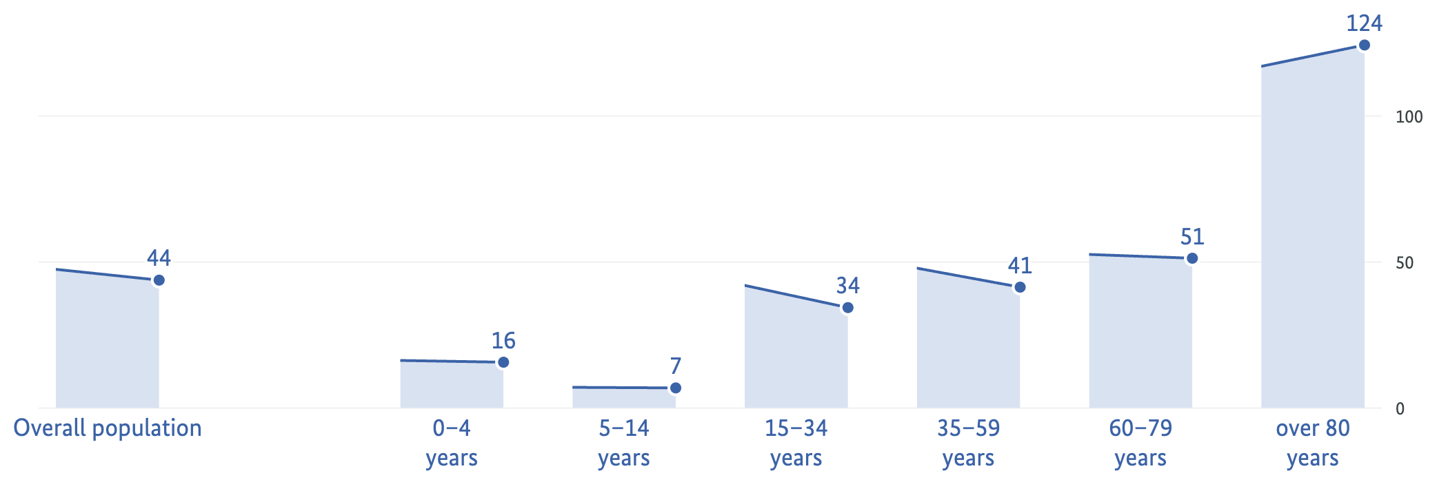
The age group view for different indicators
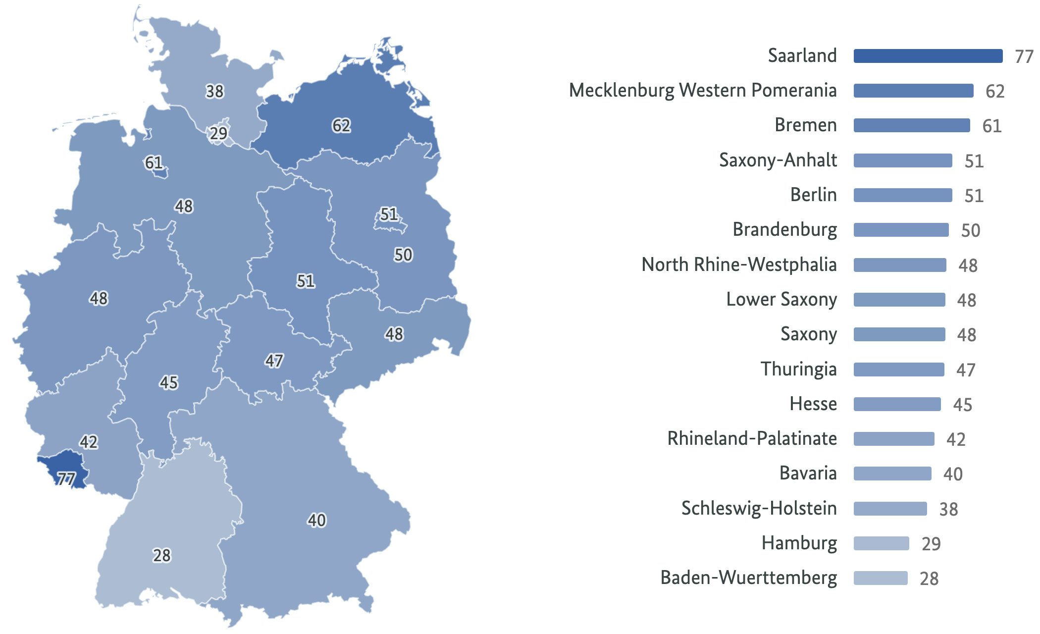
The map view for different indicators
Background
To ensure the project’s success, we provided a full-service solution, including consulting and conception, data preparation and unification, and design and implementation. We also host the project to ensure constant availability and reliable automated data updates.
Our mobile-first design attaches particular importance to accessibility, usability, and overall broad comprehensibility.
Credits
Published by Federal Ministry of Health
Comissioned by Cosmonauts & Kings
Related Case Studies
View more data visualizations and information interfaces.
A natural language search tool for managing Germany’s high-speed railway network
Making data actionable for Germany’s long distance rail network
Collaborate with us
Lets find out how we can add value to your business:
Visit us
Our Studio in Berlin
Sophienstr. 18
10178 Berlin
Legal Disclaimer
Privacy Policy